In an era where literally anyone can start a channel, it only made sense for Fubo to get in the game too. This was very new for everyone in the building, so we went through a lot of growing pains. Despite hiring producers, programmers, talent and editors, they didn’t bring in anyone for creative marketing. My team took on a lot of the marketing deliverables and design production needs, especially for Fubo’s earliest launch, Fubo Sports Network.
Client
Fubo
Year
2019
Fubo Fact
“Wear a lot of hats” is one of the many mottos at Fubo. One of my favorite “new hat” opportunities has been working on creatives for all the new channels. I’ve generated names for programming blocks like Double Play Movie Night, devised partner segments like Sports Court from Law & Crime, designed a website for Fubo Sports Network and even presented branding ideas for the Maximum Effort channel.
Designing a Website
When I got asked to design this site, I was coming in green. I had no formal experience or training designing websites but took the opportunity to try something new. I researched streaming platforms like Twitch as well as other new TV channels like Stadium.
First Sketch
Learning Miro
Obviously, I couldn’t present my embarrassing napkin sketch as a wireframe, so I had to find some way to formally clean it up. I was introduced to Miro by a designer friend and spent an evening putting the pieces together. Most of my original sketch made it into the final product.
When the email team wanted to introduce email journeys for both trial users and subscribers, we sat down together to strategize the different behaviors we wanted to reinforce. One of my ideas was an email that promotes watching content from Fubo’s original channels. I wrote up unique summaries for the channels’ original content, live sporting events and most popular syndicated programs.
Promoting Content
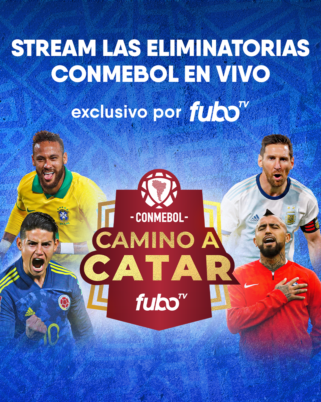
FuboTV’s First Sports Exclusive
My Campaign Mood Board
I worked closely with my art director to provide both copy and design inspiration. We each put together separate mood boards, and these two were mine. I wanted copy that emphasized the toughness of this tournament paired with imagery inspired by art from South American and brands that appeal to the Latino community.
“Don’t screw it up.”
— VP, Creative